Systems: Visual Coherence Across Touchpoints
A brand identity is not a logo. It is a system of decisions that produce consistent recognition across every context where the brand appears. The logo is one element. The typeface, color palette, spatial proportions, photography style, paper stock, and tone of voice are others. Coherence is the quality that emerges when all of these elements follow the same underlying logic.
What Coherence Is Not
Coherence is not uniformity. A brand does not need to look identical across touchpoints. A business card and a website operate under different constraints. Forcing identical proportions onto both produces awkward results. Coherence means that someone encountering the business card and the website recognizes them as belonging to the same system, even if they cannot articulate why.
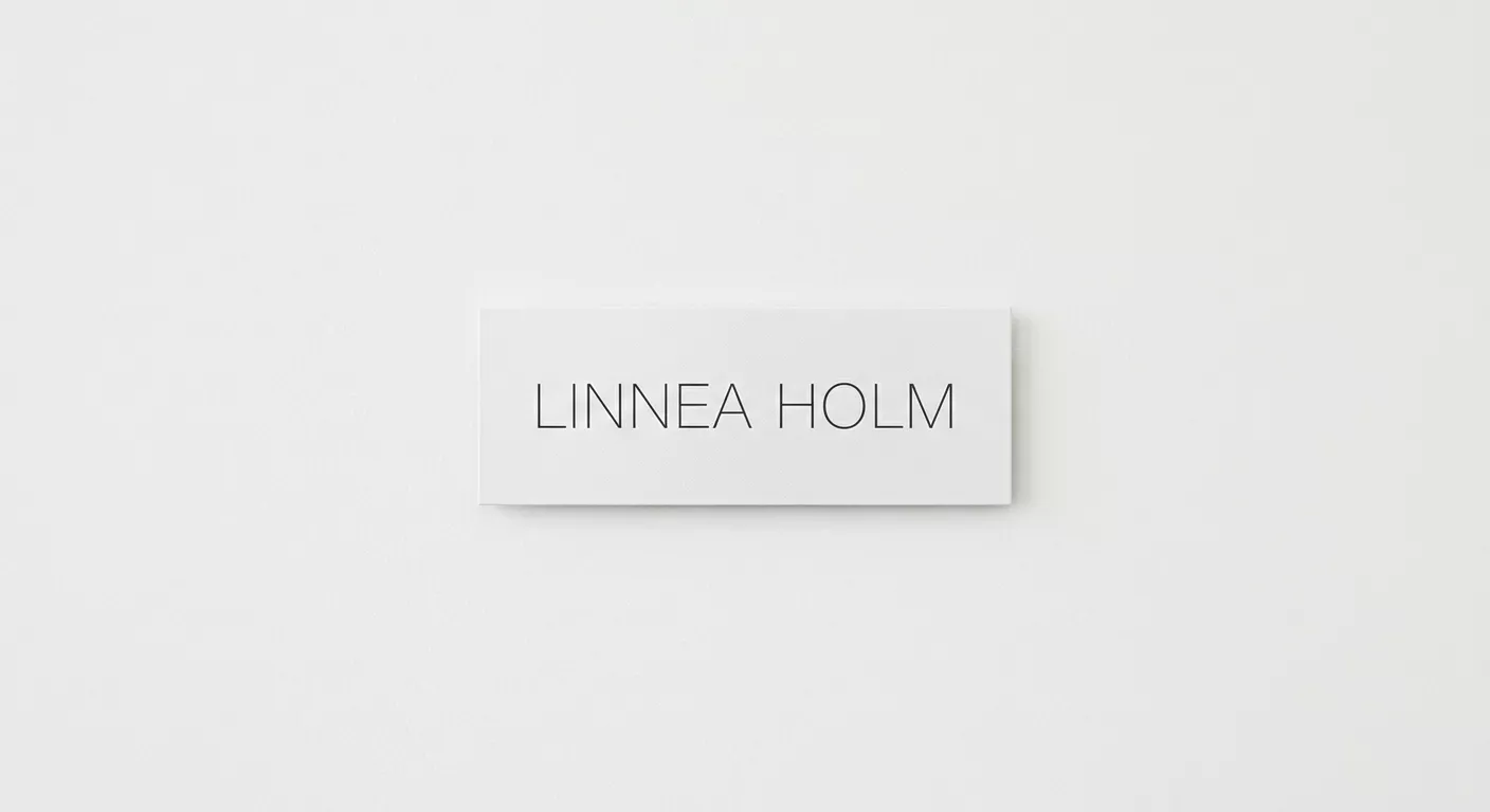
The elements that create this recognition are often the ones that designers consider secondary. The ratio of text to white space. The consistent use of a specific grey rather than black. The alignment of elements to a shared grid module. The choice to always left-align rather than center. These decisions, applied consistently, create coherence more reliably than a logo ever will.
The Audit
When the studio takes on a rebranding project, the first step is an audit. Every existing touchpoint is collected and laid out together: stationery, packaging, signage, digital screens, social media templates, email signatures, invoices. Viewed together, the gaps in coherence become visible immediately. A brand that uses Helvetica on its website and Founders Grotesk on its packaging has a coherence problem regardless of how well each individual piece is designed.
The audit reveals which elements are load-bearing and which are decorative. Load-bearing elements are the ones that carry recognition even when other elements are absent. For most brands, this is the combination of typeface and spatial proportion, not the logo.
Building the System
The deliverable is not a brand guidelines PDF. It is a set of constraints that are specific enough to ensure coherence and flexible enough to accommodate new touchpoints. Margins specified as ratios rather than fixed pixels. Type sizes specified as a scale rather than individual values. Color specified as a limited palette with clear hierarchy.
Massimo Vignelli's work for American Airlines demonstrated this. The system was simple enough that any competent designer could produce new materials that looked like they belonged, without referring to a 200-page guidelines document. Simplicity in the system produces coherence in the output.