AI Color Palette Generators, Reviewed
There are now dozens of AI-powered color palette generators available. They accept a keyword, a mood, or a reference image and return five to eight colors arranged in a horizontal strip. The palettes are typically harmonious. They are rarely useful for professional design work.
The Harmony Problem
Most generators optimize for harmony. The colors relate to each other pleasantly. They sit in complementary or analogous positions on the color wheel, with saturation and lightness values that avoid conflict. This is precisely the wrong optimization for brand design.
A brand palette does not need to be harmonious. It needs to be functional. It needs a primary color with sufficient contrast for text on white. It needs a secondary color that differentiates from competitors. It needs a neutral range for backgrounds and supporting elements. It needs an accent that draws attention without overwhelming. These are functional requirements, not aesthetic ones.
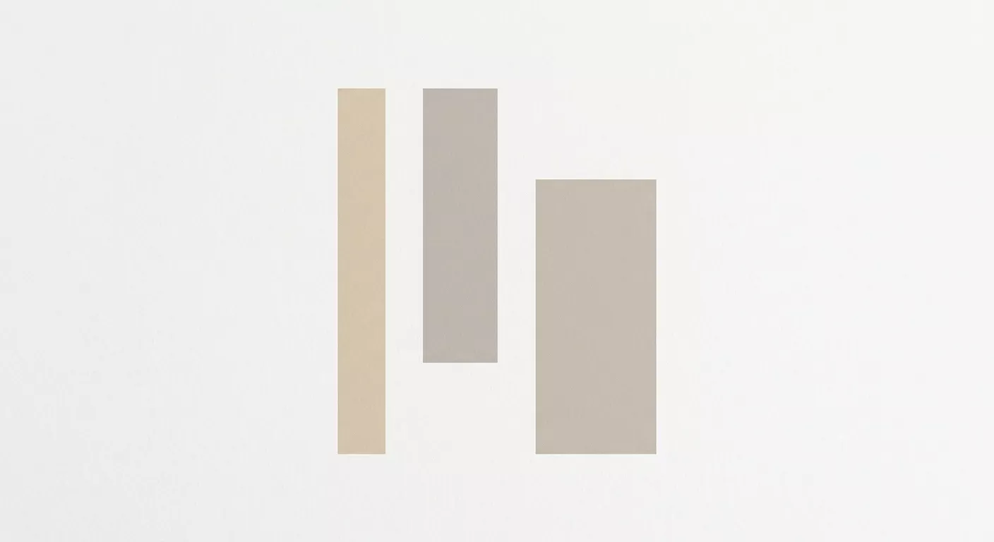
A palette generated from the keyword "Scandinavian" will return muted blues, warm greys, and soft whites. These colors are harmonious and completely generic. They do not differentiate any brand from any other brand that has also typed "Scandinavian" into a color tool.
What the Tools Miss
Color in brand design is contextual. A color does not exist in isolation. It exists on a specific substrate, next to specific other colors, in a specific competitive environment. The studio selects colors by printing swatches on the actual paper stock the brand will use, then evaluating them under the lighting conditions where the materials will be seen. A color that looks right on screen and wrong on Munken Lynx is wrong.
The tools also miss the distinction between screen color and print color. RGB palettes generated by AI tools do not translate directly to Pantone spot colors. The conversion introduces shifts, particularly in saturated blues and warm reds, that can undermine the palette's logic.
Practical Use
The generators are useful for one thing: rapid exploration of color directions at the very beginning of a project. They can suggest ranges that the designer then refines through printing, comparison, and testing. They are a starting point, not a deliverable.